Brandon Dodsworth A2 Media
Monday, 31 March 2014
Sunday, 30 March 2014
The first complete draft of my music video (with side notes.)
It was hard to screen capture the production process for my music video as I used an external editing suite with no internet access. By using this equipment I had no way of screen-shotting my work in progress and uploading each stage here onto my blog, hopefully this shouldn't hinder my overall marks greatly.
For a first draft I am surprisingly happy with how my music video has turned out so far, and think that only a few editing tweaks and replacement of certain shots will be needed to improve.
I did not stick with the intended story from my storyboard of my actors having a happy ending to their friendship as I had excess shots of darker, more depressing scenes. I think that with the mood of the song, my altered story fits better and overall works because of the low-key tone of the song lyrics.
In the end I edited the story so that for my main character (Nathan - the male) all of the negative memories of him and the girl (Georgina) build up and up throughout the video as they try to put aside their differences and fail. Eventually this gets too much for Nathan, as he burns all evidence of his existence at his home and takes off on his motorcycle to seek refuge elsewhere.
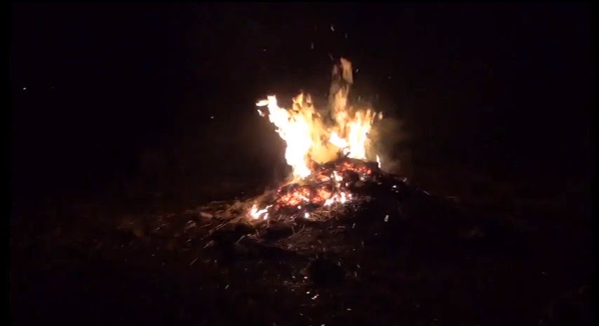
The end of the video showing him burning his possessions reveals the purpose of the intertwining story line behind the shots of the fire early on in the video. The fire is also used on the roaring first chorus of the song to symbolise passion and hatred.
Saturday, 29 March 2014
Evaluation.
In what way does your media product use, develop or challenge forms
of conventions of real media products?
In what way does your media product use, develop o by s0015257 on GoAnimate
The main product I created was a music video for the song 'Bad Blood' by the band; Bastille. As the song belongs to the indie rock genre I had to either conform or challenge the conventions of an indie rock video. I took inspiration from the music video ‘Why’d You Only Call Me When You’re High?’ by Arctic Monkeys for the genre conventional ‘boy and girl fall out’ narrative, along with basing the last part of my video on the the narrative ‘Pompeii’ by Bastille, (in which the character escapes and leaves the city).
Alongside these influenced story lines from , I used continuous shots of a blazing fire that slowly dies as a symbolism of this 'Bad Blood' (the failing relationship/friendship) between the characters to support the narrative. I think this implements an abstract element dependent on whether the audience catch onto its intended purpose. Alongside these styles, I filmed my main artist lip-syncing segments of the track which brings a performance aspect to my product also.
Due to the fact that many indie rock videos are narrative or performance based, I think that my product conforms to the codes and conventions of my chosen genre regarding stylistic features.I believe this mixture of styles creates a varied experience for the audience of my video, which I intended to make particularly engaging through the use of editing.
The editing within my video follows the heavy beat of the song, which I used to my advantage to create hidden meanings at times.Where at several points in the song, the general mood is negative, I have used black and white here to create washed out, dreary mise-en-scene.
 Whereas as these dull moments progress
towards the roaring chorus, I use the frantic few beats of the song before the chorus to transition back to colour.
I transition the image after several almost instant flashes of the image disappearing and reappearing. This can be found at regular intervals throughout my entire video, with the image flashing black for a brief half of a second when the heavy drum beat is heard.
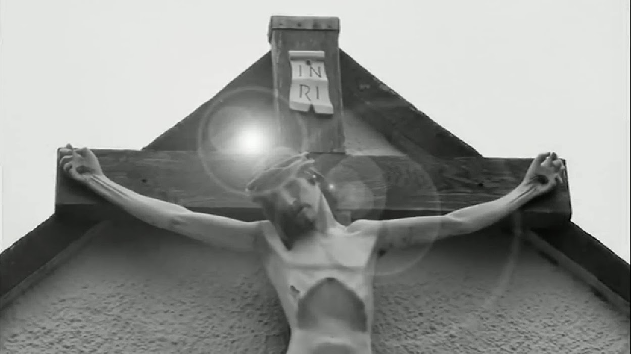 When I bring this element of brightness into my video, the lyrics 'I don't wanna hear about the bad blood anymore' can be heard, which is quite a hopeful point in the song. Whereas at other times when the lyrics are stating 'We will walk our different ways' which is more depressing, I have used dark iconography with little lighting to symbolise this.
The variety of conventional mise-en-scene for the indie rock genre is expansive and flexible, as this could include anything that is somewhat alternative. The locations I used for shooting were dark and interesting yet slightly eerie and mysterious for a large duration of my video. For example, I decided to use my friend's farm as one of the primary locations for my video, and Pickering Park as the second.
I used the setting of my friends farm on the left as the location for every fire shot due to the fact of health and safety. This was the only place we could legally light a large fire as it was open land that was owned by my friend, far from anything we could pose a hazard to.
I selected this location to fit with genre conventions as it has a murky, odd effect on camera, and when combined with the track, fits the tone and tempo of the song perfectly due to its bleak subject matter and sinister, harsh drumbeats.
The second location I selected was Pickering Park which I used for all scenes including my female model, shots including lip-syncing, and twilight shots with the moonlit pond as a backdrop.
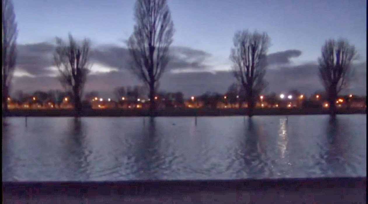
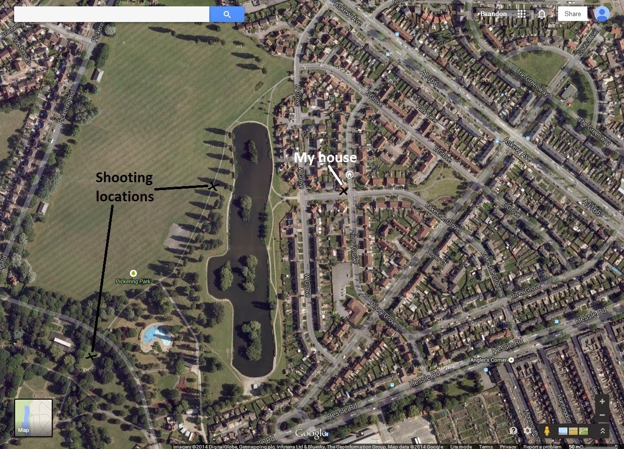 I planned and eventually used this location as it was local to me (as shown on the bottom left image below) and as it was versatile for daytime and nighttime shots. The location itself conforms with the lyrics of the song ('We were young and drinking in the park'), as well as posing as a slightly more uplifting mise-en-scene with more of a blue lighting, as opposed to the pitch black farm
The lighting I used when shooting scenes involving the farm was solely from the fire, the motorcycle headlight, and a handheld torch. If all of these light sources were to be eliminated it would have been pitch black, and the camera would not have picked up a single thing, so lighting was key. The effect these few light sources give create one focused area that is fully lit, but with darkness surrounding. This limited lighting gives off lively codes of the focused area, yet mystery and fear of the darkness.
Below is a Prezi presentation I have constructed regarding the costume in my music video.
Generally, emulating an accurate representation of real life is a key convention found within the Indie Rock genre. This is used as a gateway to another reality which an audience can either relate to, or aspire to be a part of themselves. In the Arctic Monkeys music video 'Why'd You Only Call Me When You're High?' the lead singer can be seen enjoying himself and drinking in a bar, as well as having 'girl problems', which a younger adult audience can relate to. I chose to follow this convention within my music video through it's narrative which is constructed around the topic of relationship problems, which all young people experience at one point. This makes my product relatable to, which could also provoke an emotional response from an audience.
Finally, I chose to use a variety of shots used throughout my final product. I made this decision when recording to fit the conventions of the media construct that is a music video, and to ensure that an audience are constantly being entertained and surprised by different angles and framing techniques. This constant shift in points of view will make an audience feel attached and involved within the action, as opposed to being a passive, detached viewer. For the duration of music video I have used a wide range of cinematography including framing such as: close up, medium-close up, mid, medium-long, long, and extreme long shots. Aside from types of framing I have also used other camera techniques and movement including low angle shots, camera tracking, panning shots, and tilts.
The following short clips are examples I have selected to display these varied camera techniques that I have used within my music video.
How effective is the combination of your main product and ancillary texts?
How effective is the combination of your main prod by s0015257 on GoAnimate
According to many examples of the indie rock genre that I have researched, the album artwork of many existing products is quite abstract and quirky. Indie Rock albums and digipaks sometimes even have no real relevance to any message the album or its songs are trying to convey. On the other hand, the digipaks of existing products as well as a promotional poster have always shown continuity which make the product easily recogniseable to an audience.
A great example of this would be the digipak for the Arctic Monkeys album: AM.
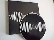 As shown to the left, the digipak for the album 'AM' does not give away a great deal about the content or genre of the album and does not really follow any codes or conventions, simply because it doesn't have to, as it is alternative. My digipak product at first seems as though it follows this trend of having very little relevance (especially when compared with my music video), although I will explain that later.
For my ancillary text products, I firstly considered to use still images of one of the already existing shots in my video containing fire, but then reconsidered against this. I chose to not go about producing them this way as this technique is widely done and overused within the music industry and would simply be too easy to take a picture on set whilst recording. This would show continuity to the extent of almost exact duplication of my main product, which I thought was not creative in the slightest. This idea did not appeal to me. For my digipak, I travelled to a specific planned location which was Hull marina and the surrounding area. There I had a specific photoshoot for my ancillary text products in which I took a diverse variety of images. I did not want to stray too far away from the general conventions of a CD digipak so chose to include my artists name and the album title to make clear to an audience exactly what they're purchasing. Each promotional package I have
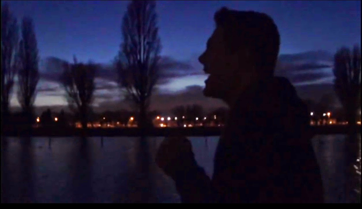
When constructing my advanced portfolio I planned to produce one ideology within my main product video which was dark and negative, which conforms with the unenthusiastic narrative of the relationship deteriorating.
I then wanted to create a second ideology throughout my ancillary text products which is slightly more positive, brighter, and contains a range of colours, yet is still slightly washed out. Through the use of these ideas in my digipak and promotional poster I decided to capture and edit images that showcase the aftermath of the events which happen throughout the music video. I did this by taking my images in daylight and used connote freedom. I created this in contrast with the emotional isolation and darkness throughout my music video.
Throughout my ancillary texts and promotional campaign, the images and colours used on each product can easily be associated with eachother, and I believe my intended use of continuity is clear.
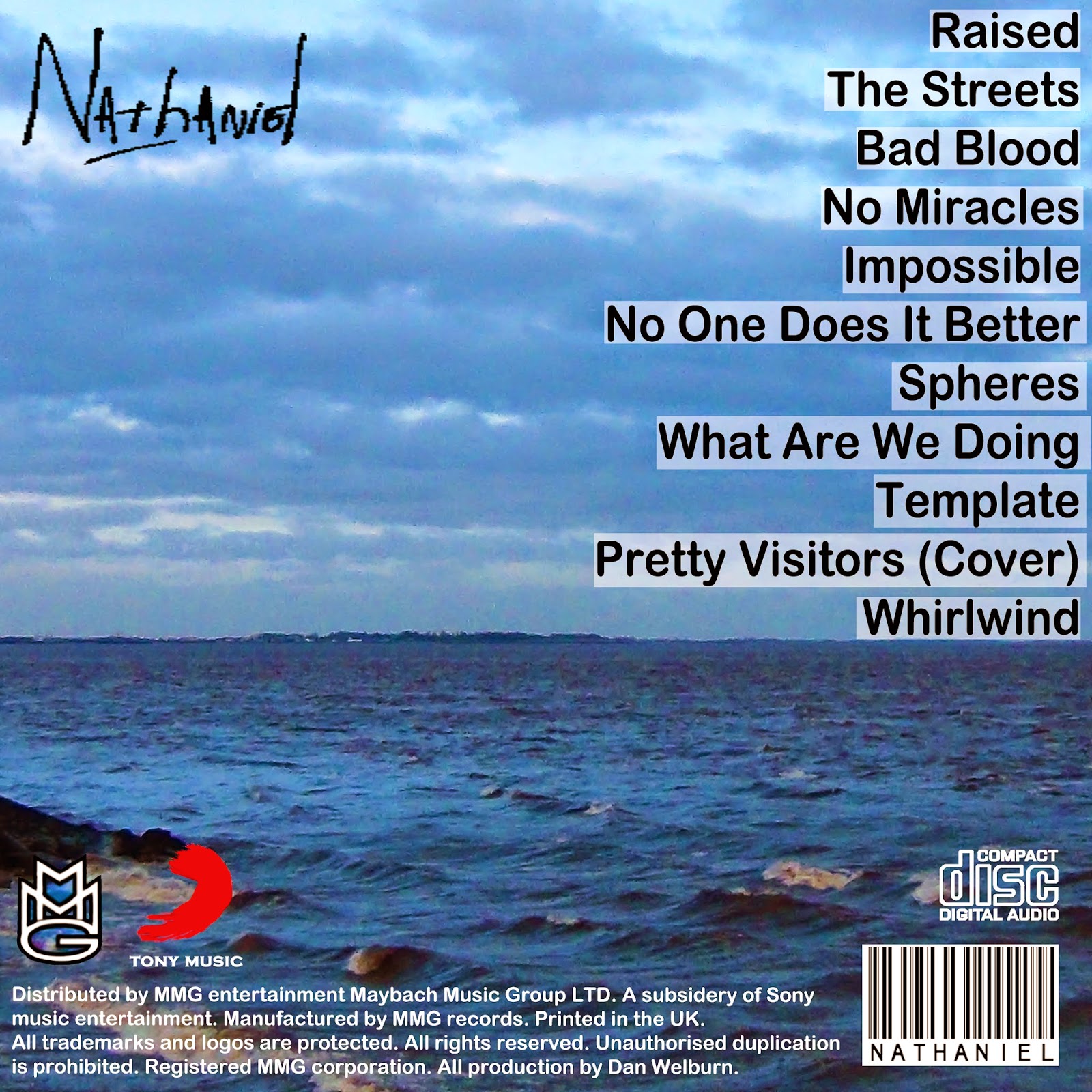 The mise-en-scene of the river Humber links many of the images in my ancillary texts together in creating one continuous product that looks realistic. I tried to make the story throughout my products easy to understand. During my video, the male character felt under pressure, he was upset, and everything was dark to him. Hence the low-key, poorly lit mise-en-scene.
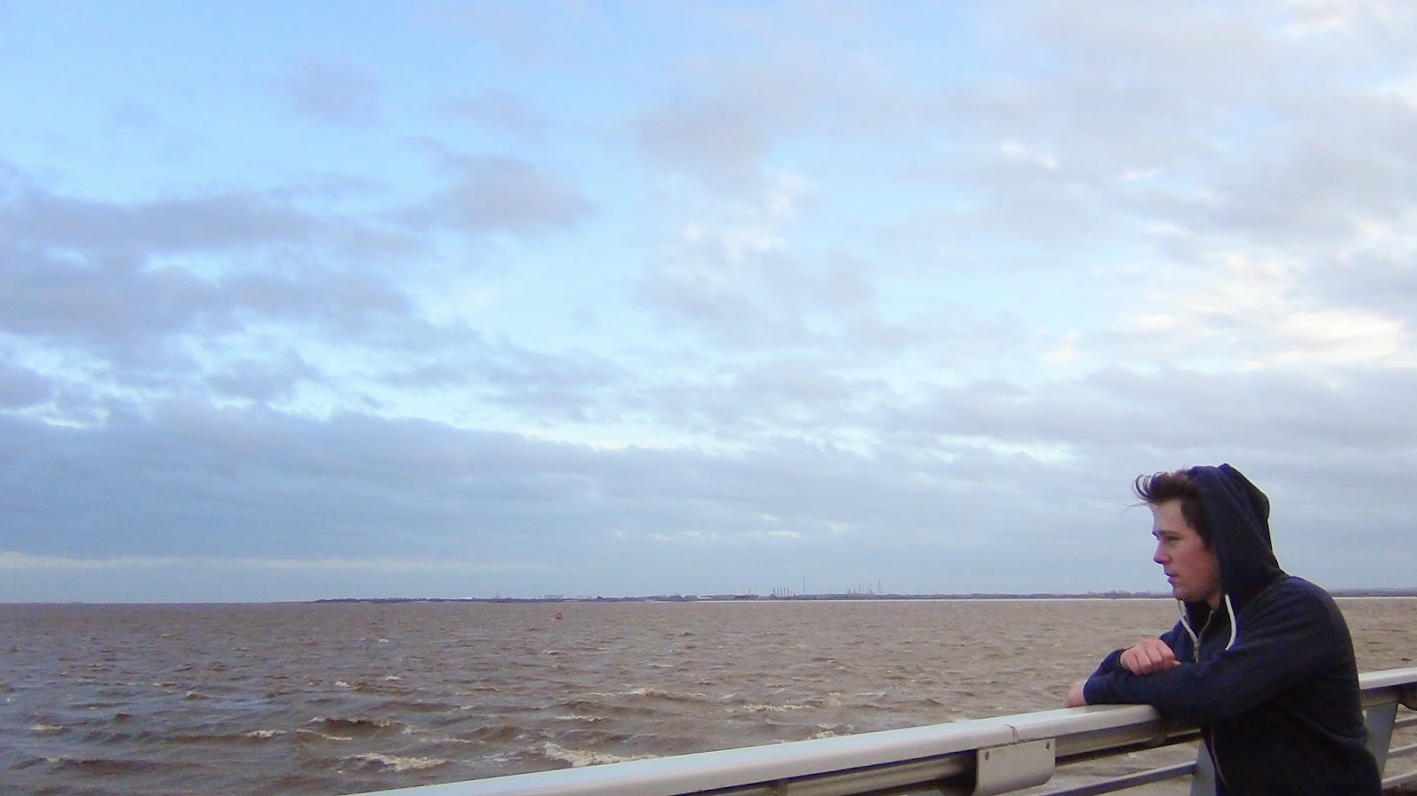
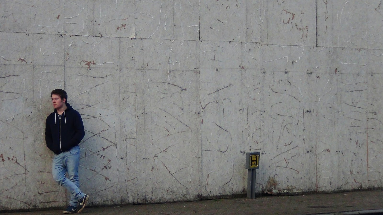
For the inside cover of my digipak, I captured two seperate images in my photoshoot on Hull marina and then created this desired effect of the character's deep thought through my editing. I used Photoshop CS5 to carry out all of my editing. I deciced to overlay the image of Nathan standing against the wall of an abandoned building over one of him looking out at the river, then reduced the opacity of the image layered on top. I then experimented with camera filters, the brightness, contrast and several hues to create a washed out effect that has codes of dillusion and reminiscence.
As shown below, other than simply copying the already established logo's of the record labels; Maybach Music Group and Sony Music, I decided to draw my own version of these logos on Adobe Photoshop so that they were not direct copies and my own product. I found a font (Copperplate Gothic Bold) which was very similar to that of Sony Music and created my own text in it's place. This ensured that all aspects of my ancillary text pieces were all my own product.
After the production of my ancillary texts, I used Photoshop to edit my album cover product onto several screenshots of my iTunes library to get an idea of how effective my project would look as an actual product. I also did the same with my promotional advert and edited it to look like it was on featured on a page within a magazine. Overall I think (assisted by my use of Photoshop to produce the above images) I have made my ancillary texts look like real and convincing products, which follow the expectations of conventional existing media forms and does well in promoting my artist, as well as the product.
I carried out various forms of audience feedback in the form of questionnaires, video feedback, and posts on social networking sites, such as Facebook.
I shared the link for my music video on YouTube to my friends on Facebook so that they could interact with the post, via comments, and 'likes' if they enjoyed the video. Soon after posting the video onto my Facebook page I had several of my friends comment very positive comments including 'Looks good, nice job mate.' and 'Brilliant work there.' which made me feel good about my product knowing my target audience enjoyed my music video. The age range of my friends on Facebook is around 16-19 which is my ideal intended age range for the audience of my product. This meant that this form of feedback allowed me to get a good insight into if my product appeals to my direct audience easily.
Alongside the positive comments and 'likes' I obtained on the post, I did get some constructive criticism in the form of 'Only nit pick suggestion is straightnening the bench scene, but that's it!' which I thanked and took into account. Through this feedback I have learned that my product appeals to my target audience although slight improvements could have been made to several, 3 second duration shots on the bench. If I were to re-shoot my video I would use this audience feedback to my advantage and correct the small issue by stabilising my camera on a tripod and attempt to make the shot as straight as possible, although this was hard and probably didn't turn out as intended due to the fact I was shooting on uneven muddy ground.
As previously mentioned, I also carried out audience research in the form of a questionnaire I posed to 30 fellow students that are part of my target audience. Here are several examples of these:
These questionnaires I posed to other students allowed me to get a more in depth insight into the opinions of my target audience regarding: if they understood my genre, what they liked, what they disliked, and if they understood my sense of continuity. I received very positive feedback from these questionnaires, including helpful comments on what people would improve about my music video.
Out of the data I have collected I compiled my statistics into a document on Microsoft Excel and produced several charts which helped me track the information easily, which outlines the strong points of my product and what I did well.
Overall, 26 out of the 30 people that I posed my questionnaire to understood that the genre of my music video was indie rock. All of the other 4 thought that my video was of the indie pop sub-genre, which isn't straying too far from my intended genre, so overall I have gathered that my video was very successful in portraying my chosen genre.
Above is a chart I have created from the data recieved from the question I posed that asked: 'Is it clear what the genre of my music video is? Why?'. From my findings it has become evident that the biggest factor in assisting the 26 people to understand my genre was the location I used to shoot my video on. This predominantly meant the farm location with the fire, which almost every person I recieved feedback from praised. When asking an audience 'If you could change anything about my music video for improvement, what would it be?' several individuals noted that although they really enjoy my video, the scenes in the park look slightly unprofessional in comparison to others on the farm and the surrounding area.
In all honesty after taking the criticism into account I have come to realise that these scenes do in fact look significantly less professional than the darker farm scenes. I think this due to the fact that I shot these segments in broad daylight so afterwards had to reduce the opacity of the clips and add a black and white effect on Premier Pro to achieve the dreary ideology I required for my video. Although how I edited the video certainly achieves this, I've realised and can agree that it doesn't look as dull, dark and exciting as some of the other shots in my video. If I could re-shoot these scenes I would have had a video shoot later on (10pm onwards) to ensure that it was as dark as the other sections of my video, which many have said they particularly enjoyed. I think if I did this, I could continue the exact mise-en-scene in regards to lighting throughout which would visually increase the quality of my video.
For the section of my questionnaire which enquires 'Do you like my video? If so, what stands out?' I asked each individual to answer in honesty, and specifically selected people that I don't usually talk to. From this I recieved the feedback that 100% of the people who I selected to answer the questionnaire enjoyed my video. Below is the data regarding why people enjoyed my video. And as shown below, 12 out of the 30 people said they really enjoyed the fire shots, which seemed to be one of the main stand-out factors of my video. Alongside the simple facts, I also recieved comments that people believed the fire shots were a main feature that stood out due to the fact that it was a unique choice, that the fires bright colours were a great contrast from the gloomy black and white, and finally that my use of cinematography (specifically certain angles and extreme close ups) when shooting the fire was very effective.
For the question 'Do you think my ancillary texts show continuity? If so, how are they linked?' I showed each person my digipak product, disc, an promotional poster advert. Every person I asked felt as though continuity throughout my products was clear in the terms shown below:
When capturing photos for my ancillary text I had the exact ideas in mind to feature a vibrant blue effect, and locations featuring water within many of the images (whilst keeping slight variety), so I am glad these two ideas were picked up on by my target audience. In terms of improvement here I believe that when it comes to continuity I would not really change anything about images, apart from maybe apply a slightly blue hue to other elements of the digipak on photoshop, although I think my images look effective as they are. Confidence in my images were given to me when a teacher questioned whether or not the photograph on my back cover was actually mine, and complimenting me on it after proving its validity. Even this in itself was a form of audience feedback and this opinion made me feel positively inclined to keep my chosen image on the back cover of my digipak.
Alongside my questionnaires. I interviewed a new selection of students that belong to my target audience for some video feedback. For this I first showed them my product, then asked a different set of questions and recieved the opinions of others face to face whilst recording. I believe this was a great alternative way of recieving feedback as opposed to questionnaires and socal media posts as it allowed a more honest reaction to my product. I think this is assisted by the fact that seeing the reactions of those watching your product is more helpful and different as a form of feedback as opposed to receiving written answer back on paper.
When asking an audience if they understood the narrative of my product, out of the five people I interviewed, each one of them understood that my music videos narrative was that of a struggling relationship, which caused enough pressure for the main character to escape it all. I especially liked the response I received from Josie, in the second link featured above. When asked, she stated that my narrative was 'a personal realisation of the main character, prompted by the fact that he was in a bad relationship and needed to get out of it', which I felt hit the nail on the head perfectly, as this is the exact story I attempted to convey. I was pleased with the responses of this question.
When asking the question 'Is Mise-en-scene, editing, or cinematography most dominant in my video? And how?' I received mixed responses that my use of editing (to the beat of the music and changing opacity to blend images), as well as the location I used being the most stand-out factors. When producing my video I spent the most time on the editing of my video, and it was especially hard to get timings correct to edit to the beat. Due to this fact I appreciated that my use of editing was picked up on and enjoyed by an audience. When selecting location it came naturally, as my friend had just moved onto a new farm, and I needed to select a location to legally light a large fire (a main consideration in my health and safety) as well as create a negative ideology through dark mise-en-scene. It came as an immediate thought that the farm would be a perfect location to use, shooting at close to midnight so that it was pitch black and using only the fire, a motorcycle headlight and a torch function on my mobile to create a concentrated area of lighting, surrounding by darkness. From this I have found that my cinematography was obviously not an evident stand-out factor although I am happy that both of these aspects were acknowledged.
For the final part of this form of audience feedback, I posed the question: 'If you could make any improvements to my music video, what would they be?'. Much like in my written questionnaire where people stated that they were not particularly fond of the park bench scene, for both of the answers I have linked above to this question gave me the same answer. Coincidently, both students in the YouTube videos above state how they think that the bench scene is very cliche. In these audience feedback videos it is also stated how the contrast from the dark scenes (filmed at the farm) to this lighter bench scene does not look effective, and that it should be taken out or at least shortened. Through having this viewpoint repeated to me throughout my feedback, this would help me as if I were to re-shoot my video I would definitely shoot these scenes on another area of the farm whilst it is darker, so that it fits with the rest of the video.
How did you use media technologies in the construction and research, planning and evaluation stages?
How did you use media technologies in the construc by s0015257 on GoAnimate
I used a very large variety of media technologies to produce my advanced porfolio, many media forms deriving from the utilisation of web 2.0. Firstly and most importantly I have been keeping a database of all of my work (ranging from research and planning, to theory, to the drafting process of my products) right here on Blogger. For every piece of work I have produced I have created a seperate post, titling, dating and laying them out accordingly so that they are easy to find and access in one place.
My use of Web 2.0 was the largest contributer to my research process. For the researching stage of my advanced portfolio I searched for, watched and analysed many music videos (specifically of my chosen genre) using the Google search engine. Web 2.0 allows the use of user created information, other than simply being able to read information. I utilised this feature to browse the internet for sites such as YouTube for example, a video sharing website consisting entirely of user created content. After using the service to browse through many suitable examples that I could take inspiration from, I selected three examples to carry out an in depth textual analysis on.
In my textual analysis post (which you can access by clicking here), I included a link to each video, their directors and writers (which I also found using various search engines such as Google and Bing), text, and video screenshots which assists me in explaining my own analytical viewpoints on the 4 key elements; Mise-en-scene, cinematography, editing, and sound, which I put great care and effort into, totalling up at 5110 words. Through using YouTube to carry this task out, I obtained many ideas which I had identified which I could use in my own product.
In my planning and research stage, I also used YouTube to upload any videos onto my personal 'channel' that I created specifically for my media project. These videos consist of shots that did not make it onto the final product, planned drawn shots (animatic), video drafts and focus group sessions for my research. Due to the fact that web 2.0 widely enables interactivity, it is possible to recieve feedback on my videos via 'likes', 'dislikes' or comments, which will allow me to obtain further audience feedback from what I have already carried out through questionnaires, posts on social networking sites such as Facebook, and video feedback.
Another major form of media technologies I used were the editing suites, and Adobe Premier Pro CS6.
The editing suites were external systems (seperate from PC's) loaded with programs such as Adobe Premier Pro CS6, and Adobe Photoshop, specifically used for video and photo editing. The system features a 1Terabyte hard drive for all of this data to be stored.
Here is a presentation created on Slideshare which explains how I utilised the software.
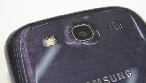
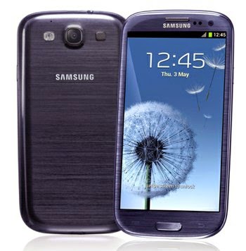
To add to the list of media technologies that I have used, I also used more portable and personal devices such as my Samsung Galaxy SIII mobile phone. I used my Galaxy SIII to take pictures of my planned locations, my storyboard sheets (to construct my animatic), images of me filming and right here in my evaluation to display my use of Premier Pro.
I used my mobile phone as the image quality is up to scratch with modern camera's at 8 mega pixels. My Samsung Galaxy SIII was also portable, and on-hand at all times, which ensured that if needed I could capture images or any other content to feature in my advanced portfolio at any time, anywhere. My mobile phone also features a precision voice recorder, camcorder, and applications which I used within my filming process. A key application I used from my mobile phone when filming was the flashlight function, which I used as a primary source of lighting in shots at the farm, due to the fact that without the fire, the setting was pitch black.
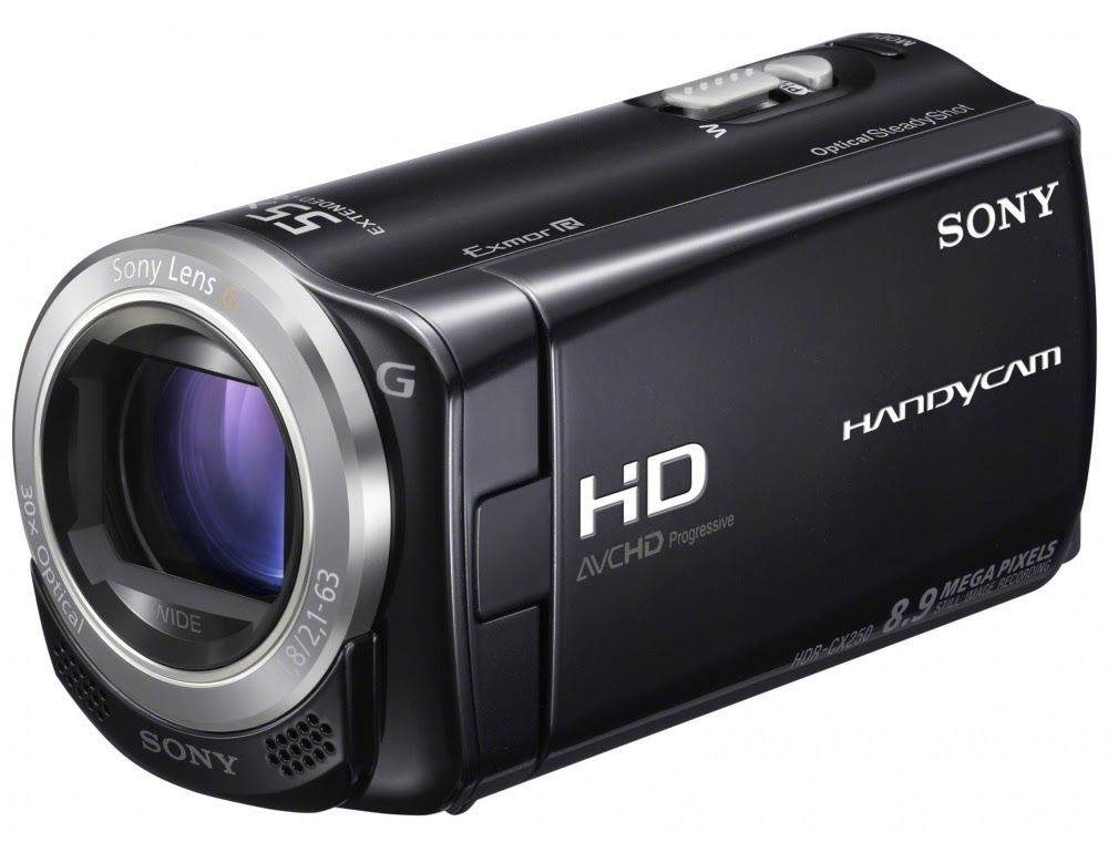 The camera I used for filming my video was a Sony Handycam HDR-CX115 HD. The features of the camera include a screw fit port which I used to attach a tripod to for stabilisation of images, the camera also boasts a 8.9 mega pixel camera which was perfect for achieving a high quality video. The camera is also small, compact and light, featuring a simple touchscreen interface, which was easy to use and get used to. The Sony Handycam also has an SD memory card slot (for the easy storage and transferring of clips to the editing suite) and a long 25x optical zoom. The optical zoom helped in variating my framing (close ups for example), without distortion of the image.
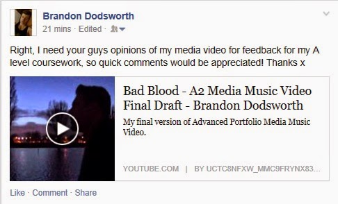
As previously shown, I have also used Web 2.0 to produce posts on social networking sites including Facebook and Instagram, to obtain feedback for my media product. This allowed my friends to comment their opinions on my music video, which were generally very positive. It also allowed me to gain audience feedback in a sense that would help me if I were to make changes to my product, so that it would appeal more to my target audience.
Adobe Photoshop CS5 was a massive contributer to my ancillary products, and I would not have been able to produce them without the software. In many previous posts I have shown the production process for each step of my products (which you can access by clicking here, here, and here for a few examples). Photoshop is an advance image manipulating software which enables the editing of digitial photographs in many different aspects including the ability to format, crop, and balance colours and tones of images.
For instance, to produce my digipak front cover I carried out the following process:
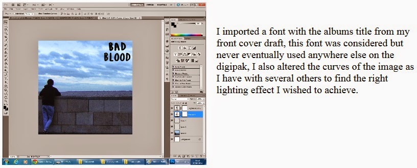
Adobe Photoshop allowed me to transform an ordinary image I had taken into an interesting part of my digipak which looks like a convincing product.
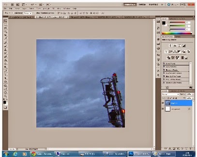
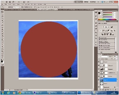
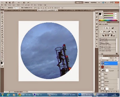 With many tools and effects used for image editing, further features of Photoshop I used within my work were the ability to remove blemishes, the fact images can be perfected and altered in many ways including light levels and colour, and specific objects can be cut out of an image using the magnetic lasso tool (which I used below to cut around the disc sized circle I created using the shape tool), to name a few.
In what way does your media product use, develop o by s0015257 on GoAnimate
The main product I created was a music video for the song 'Bad Blood' by the band; Bastille. As the song belongs to the indie rock genre I had to either conform or challenge the conventions of an indie rock video. I took inspiration from the music video ‘Why’d You Only Call Me When You’re High?’ by Arctic Monkeys for the genre conventional ‘boy and girl fall out’ narrative, along with basing the last part of my video on the the narrative ‘Pompeii’ by Bastille, (in which the character escapes and leaves the city).
I then decided to combine the two ideas from these real media products to form the foundations of my video's story, although the way I went about reproducing these inspirational narratives was using my own creative ideas. I planned to make a video with clear continuity, but also have two intertwining narratives. One narrative consisting of the couples struggling relationship, whereas the other focuses on the male's deteriorating mentality as he burns his possessions and flees on his motorcycle.
The following two videos for example are produced by the very successful indie rock band; Arctic Monkeys, yet stylistically are performance based (left), and narrative (right). I think I have subtly and successfully combined these two elements within my product.
Alongside these influenced story lines from , I used continuous shots of a blazing fire that slowly dies as a symbolism of this 'Bad Blood' (the failing relationship/friendship) between the characters to support the narrative. I think this implements an abstract element dependent on whether the audience catch onto its intended purpose. Alongside these styles, I filmed my main artist lip-syncing segments of the track which brings a performance aspect to my product also.
Due to the fact that many indie rock videos are narrative or performance based, I think that my product conforms to the codes and conventions of my chosen genre regarding stylistic features.I believe this mixture of styles creates a varied experience for the audience of my video, which I intended to make particularly engaging through the use of editing.
The editing within my video follows the heavy beat of the song, which I used to my advantage to create hidden meanings at times.Where at several points in the song, the general mood is negative, I have used black and white here to create washed out, dreary mise-en-scene.
 Whereas as these dull moments progress
towards the roaring chorus, I use the frantic few beats of the song before the chorus to transition back to colour.
I transition the image after several almost instant flashes of the image disappearing and reappearing. This can be found at regular intervals throughout my entire video, with the image flashing black for a brief half of a second when the heavy drum beat is heard.
I believe that this use of editing throughout my product makes the viewing experience more dynamic through shots that would usually be less exciting. I also utilise this form of editing to simulate a harsh, cutting effect which fits with the dark mood and mise-en-scene of the song. Editing to the beat of the music is not conventionally found within indie rock music videos and is usually found in more dance-orientated products. I used this technique of editing to the beat to perform instant straight cuts between shots. Straight cuts between shots in the indie rock genre is conventional, although the way I have chosen to go about this is not.
In the section of my music video that provides an uplifting nostalgic mood with the lyrics "I don't wanna hear about the Bad Blood anymore" I chose to use a fade to black transition which smoothly eased its way into a flashback-like collection of shots. Within these shots I chose to add a lens flare effect to apply the effect of bright sunlight, which connote clarity and happiness, to fit with the lyrics of the song. In this aspect of editing, my video challenges the codes and conventions of most real media products of my chosen genre, although I think my product only benefits from this decision I made in the editing the process. I believe through examples such as this bright lens flare, the iconography of my video fits with the lyrics fully.
 When I bring this element of brightness into my video, the lyrics 'I don't wanna hear about the bad blood anymore' can be heard, which is quite a hopeful point in the song. Whereas at other times when the lyrics are stating 'We will walk our different ways' which is more depressing, I have used dark iconography with little lighting to symbolise this.
 The variety of conventional mise-en-scene for the indie rock genre is expansive and flexible, as this could include anything that is somewhat alternative. The locations I used for shooting were dark and interesting yet slightly eerie and mysterious for a large duration of my video. For example, I decided to use my friend's farm as one of the primary locations for my video, and Pickering Park as the second.
I used the setting of my friends farm on the left as the location for every fire shot due to the fact of health and safety. This was the only place we could legally light a large fire as it was open land that was owned by my friend, far from anything we could pose a hazard to.
I selected this location to fit with genre conventions as it has a murky, odd effect on camera, and when combined with the track, fits the tone and tempo of the song perfectly due to its bleak subject matter and sinister, harsh drumbeats.
The second location I selected was Pickering Park which I used for all scenes including my female model, shots including lip-syncing, and twilight shots with the moonlit pond as a backdrop.

 I planned and eventually used this location as it was local to me (as shown on the bottom left image below) and as it was versatile for daytime and nighttime shots. The location itself conforms with the lyrics of the song ('We were young and drinking in the park'), as well as posing as a slightly more uplifting mise-en-scene with more of a blue lighting, as opposed to the pitch black farm
The lighting I used when shooting scenes involving the farm was solely from the fire, the motorcycle headlight, and a handheld torch. If all of these light sources were to be eliminated it would have been pitch black, and the camera would not have picked up a single thing, so lighting was key. The effect these few light sources give create one focused area that is fully lit, but with darkness surrounding. This limited lighting gives off lively codes of the focused area, yet mystery and fear of the darkness.
Below is a Prezi presentation I have constructed regarding the costume in my music video.
Generally, emulating an accurate representation of real life is a key convention found within the Indie Rock genre. This is used as a gateway to another reality which an audience can either relate to, or aspire to be a part of themselves. In the Arctic Monkeys music video 'Why'd You Only Call Me When You're High?' the lead singer can be seen enjoying himself and drinking in a bar, as well as having 'girl problems', which a younger adult audience can relate to. I chose to follow this convention within my music video through it's narrative which is constructed around the topic of relationship problems, which all young people experience at one point. This makes my product relatable to, which could also provoke an emotional response from an audience.
 |
| Close up of the distorted moon. |
 |
| Mid shot of Nathan on his motorcycle from a low angle. |
Finally, I chose to use a variety of shots used throughout my final product. I made this decision when recording to fit the conventions of the media construct that is a music video, and to ensure that an audience are constantly being entertained and surprised by different angles and framing techniques. This constant shift in points of view will make an audience feel attached and involved within the action, as opposed to being a passive, detached viewer. For the duration of music video I have used a wide range of cinematography including framing such as: close up, medium-close up, mid, medium-long, long, and extreme long shots. Aside from types of framing I have also used other camera techniques and movement including low angle shots, camera tracking, panning shots, and tilts.
 |
| Medium close up of my male model. |
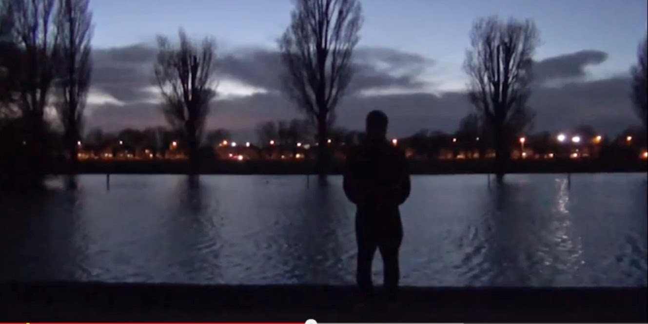 |
| Extreme long shot of Nathan. |
The following short clips are examples I have selected to display these varied camera techniques that I have used within my music video.
How effective is the combination of your main product and ancillary texts?
How effective is the combination of your main prod by s0015257 on GoAnimate
According to many examples of the indie rock genre that I have researched, the album artwork of many existing products is quite abstract and quirky. Indie Rock albums and digipaks sometimes even have no real relevance to any message the album or its songs are trying to convey. On the other hand, the digipaks of existing products as well as a promotional poster have always shown continuity which make the product easily recogniseable to an audience.
A great example of this would be the digipak for the Arctic Monkeys album: AM.
 As shown to the left, the digipak for the album 'AM' does not give away a great deal about the content or genre of the album and does not really follow any codes or conventions, simply because it doesn't have to, as it is alternative. My digipak product at first seems as though it follows this trend of having very little relevance (especially when compared with my music video), although I will explain that later.
For my ancillary text products, I firstly considered to use still images of one of the already existing shots in my video containing fire, but then reconsidered against this. I chose to not go about producing them this way as this technique is widely done and overused within the music industry and would simply be too easy to take a picture on set whilst recording. This would show continuity to the extent of almost exact duplication of my main product, which I thought was not creative in the slightest. This idea did not appeal to me. For my digipak, I travelled to a specific planned location which was Hull marina and the surrounding area. There I had a specific photoshoot for my ancillary text products in which I took a diverse variety of images. I did not want to stray too far away from the general conventions of a CD digipak so chose to include my artists name and the album title to make clear to an audience exactly what they're purchasing. Each promotional package I have

When constructing my advanced portfolio I planned to produce one ideology within my main product video which was dark and negative, which conforms with the unenthusiastic narrative of the relationship deteriorating.
I then wanted to create a second ideology throughout my ancillary text products which is slightly more positive, brighter, and contains a range of colours, yet is still slightly washed out. Through the use of these ideas in my digipak and promotional poster I decided to capture and edit images that showcase the aftermath of the events which happen throughout the music video. I did this by taking my images in daylight and used connote freedom. I created this in contrast with the emotional isolation and darkness throughout my music video.
Throughout my ancillary texts and promotional campaign, the images and colours used on each product can easily be associated with eachother, and I believe my intended use of continuity is clear.
 The mise-en-scene of the river Humber links many of the images in my ancillary texts together in creating one continuous product that looks realistic. I tried to make the story throughout my products easy to understand. During my video, the male character felt under pressure, he was upset, and everything was dark to him. Hence the low-key, poorly lit mise-en-scene.
My ancillary texts are supposed to represent the morning after the events of my video where the male character is reflecting over what has happened at the destination that he has travelled to on his motorcycle. I intended to show this mostly through the chosen 'end of the line' location that is the river, and through the editing of my images on photoshop.


For the inside cover of my digipak, I captured two seperate images in my photoshoot on Hull marina and then created this desired effect of the character's deep thought through my editing. I used Photoshop CS5 to carry out all of my editing. I deciced to overlay the image of Nathan standing against the wall of an abandoned building over one of him looking out at the river, then reduced the opacity of the image layered on top. I then experimented with camera filters, the brightness, contrast and several hues to create a washed out effect that has codes of dillusion and reminiscence.
 |
| Before (first draft edit.) |
 |
| After (final draft edit.) |
Regarding my promotional poster, the links to my other products are clear. Such as in the case of many of the promotional posters I have researched, I have implemented my album covers main image onto the poster, and have also featured a collection of clear borrowings.
My advertising campaign is made strong by the fact that I have imported the album's title/logo and the artists name in the same format as my digipak, and have used this same main image from my front cover, although have variated the framing to fit portrait poster dimensions. This shows continuity which an audience can recognise, and associate with the digipak instantly. This is used to promote a product successfully throughout real advertising campaigns.
I have used Photoshop CS5 to reduce the vibrancy of the main image from my front cover so that the text stands out over any other aspect, as this text is what contains the actual information on when the product consumed, and the contents of the album, for example.
Below is an image taken from powerpoint discussing the text used on my ancillary texts.
.As shown below, other than simply copying the already established logo's of the record labels; Maybach Music Group and Sony Music, I decided to draw my own version of these logos on Adobe Photoshop so that they were not direct copies and my own product. I found a font (Copperplate Gothic Bold) which was very similar to that of Sony Music and created my own text in it's place. This ensured that all aspects of my ancillary text pieces were all my own product.
When producing my complete digipak I wanted to ensure that continuity of this ideology was clear. To conform with this I featured similar drained out colours on each of my images (mainly washed out blues) apart from the brightness in the bottom left hand image in the alleyway. I wanted to produce this image to show that my model was in a dark place, and is looking out towards to the light, which symbolises positivity. I had two seperate shoots for my ancillary text products on two seperate days (Wednesday 5th February and Saturday 8th February), although I ensured that my model wore the same costume for both days to carry a sense of chronology throughout my product, other than different styles of images being everywhere which give off different ideologies.
What have you learned from your audience feedback?
What have you learned from your audience feedback? by s0015257 on GoAnimate
What have you learned from your audience feedback? by s0015257 on GoAnimate
I carried out various forms of audience feedback in the form of questionnaires, video feedback, and posts on social networking sites, such as Facebook.
Alongside the positive comments and 'likes' I obtained on the post, I did get some constructive criticism in the form of 'Only nit pick suggestion is straightnening the bench scene, but that's it!' which I thanked and took into account. Through this feedback I have learned that my product appeals to my target audience although slight improvements could have been made to several, 3 second duration shots on the bench. If I were to re-shoot my video I would use this audience feedback to my advantage and correct the small issue by stabilising my camera on a tripod and attempt to make the shot as straight as possible, although this was hard and probably didn't turn out as intended due to the fact I was shooting on uneven muddy ground.
As previously mentioned, I also carried out audience research in the form of a questionnaire I posed to 30 fellow students that are part of my target audience. Here are several examples of these:
These questionnaires I posed to other students allowed me to get a more in depth insight into the opinions of my target audience regarding: if they understood my genre, what they liked, what they disliked, and if they understood my sense of continuity. I received very positive feedback from these questionnaires, including helpful comments on what people would improve about my music video.
Out of the data I have collected I compiled my statistics into a document on Microsoft Excel and produced several charts which helped me track the information easily, which outlines the strong points of my product and what I did well.
Overall, 26 out of the 30 people that I posed my questionnaire to understood that the genre of my music video was indie rock. All of the other 4 thought that my video was of the indie pop sub-genre, which isn't straying too far from my intended genre, so overall I have gathered that my video was very successful in portraying my chosen genre.
Above is a chart I have created from the data recieved from the question I posed that asked: 'Is it clear what the genre of my music video is? Why?'. From my findings it has become evident that the biggest factor in assisting the 26 people to understand my genre was the location I used to shoot my video on. This predominantly meant the farm location with the fire, which almost every person I recieved feedback from praised. When asking an audience 'If you could change anything about my music video for improvement, what would it be?' several individuals noted that although they really enjoy my video, the scenes in the park look slightly unprofessional in comparison to others on the farm and the surrounding area.
For the section of my questionnaire which enquires 'Do you like my video? If so, what stands out?' I asked each individual to answer in honesty, and specifically selected people that I don't usually talk to. From this I recieved the feedback that 100% of the people who I selected to answer the questionnaire enjoyed my video. Below is the data regarding why people enjoyed my video. And as shown below, 12 out of the 30 people said they really enjoyed the fire shots, which seemed to be one of the main stand-out factors of my video. Alongside the simple facts, I also recieved comments that people believed the fire shots were a main feature that stood out due to the fact that it was a unique choice, that the fires bright colours were a great contrast from the gloomy black and white, and finally that my use of cinematography (specifically certain angles and extreme close ups) when shooting the fire was very effective.
For the question 'Do you think my ancillary texts show continuity? If so, how are they linked?' I showed each person my digipak product, disc, an promotional poster advert. Every person I asked felt as though continuity throughout my products was clear in the terms shown below:
When capturing photos for my ancillary text I had the exact ideas in mind to feature a vibrant blue effect, and locations featuring water within many of the images (whilst keeping slight variety), so I am glad these two ideas were picked up on by my target audience. In terms of improvement here I believe that when it comes to continuity I would not really change anything about images, apart from maybe apply a slightly blue hue to other elements of the digipak on photoshop, although I think my images look effective as they are. Confidence in my images were given to me when a teacher questioned whether or not the photograph on my back cover was actually mine, and complimenting me on it after proving its validity. Even this in itself was a form of audience feedback and this opinion made me feel positively inclined to keep my chosen image on the back cover of my digipak.
Alongside my questionnaires. I interviewed a new selection of students that belong to my target audience for some video feedback. For this I first showed them my product, then asked a different set of questions and recieved the opinions of others face to face whilst recording. I believe this was a great alternative way of recieving feedback as opposed to questionnaires and socal media posts as it allowed a more honest reaction to my product. I think this is assisted by the fact that seeing the reactions of those watching your product is more helpful and different as a form of feedback as opposed to receiving written answer back on paper.
When asking an audience if they understood the narrative of my product, out of the five people I interviewed, each one of them understood that my music videos narrative was that of a struggling relationship, which caused enough pressure for the main character to escape it all. I especially liked the response I received from Josie, in the second link featured above. When asked, she stated that my narrative was 'a personal realisation of the main character, prompted by the fact that he was in a bad relationship and needed to get out of it', which I felt hit the nail on the head perfectly, as this is the exact story I attempted to convey. I was pleased with the responses of this question.
When asking the question 'Is Mise-en-scene, editing, or cinematography most dominant in my video? And how?' I received mixed responses that my use of editing (to the beat of the music and changing opacity to blend images), as well as the location I used being the most stand-out factors. When producing my video I spent the most time on the editing of my video, and it was especially hard to get timings correct to edit to the beat. Due to this fact I appreciated that my use of editing was picked up on and enjoyed by an audience. When selecting location it came naturally, as my friend had just moved onto a new farm, and I needed to select a location to legally light a large fire (a main consideration in my health and safety) as well as create a negative ideology through dark mise-en-scene. It came as an immediate thought that the farm would be a perfect location to use, shooting at close to midnight so that it was pitch black and using only the fire, a motorcycle headlight and a torch function on my mobile to create a concentrated area of lighting, surrounding by darkness. From this I have found that my cinematography was obviously not an evident stand-out factor although I am happy that both of these aspects were acknowledged.
 |
| Farm scene, which mise-en-scene was positively commented on. |
 |
| Bench scene. |
For the final part of this form of audience feedback, I posed the question: 'If you could make any improvements to my music video, what would they be?'. Much like in my written questionnaire where people stated that they were not particularly fond of the park bench scene, for both of the answers I have linked above to this question gave me the same answer. Coincidently, both students in the YouTube videos above state how they think that the bench scene is very cliche. In these audience feedback videos it is also stated how the contrast from the dark scenes (filmed at the farm) to this lighter bench scene does not look effective, and that it should be taken out or at least shortened. Through having this viewpoint repeated to me throughout my feedback, this would help me as if I were to re-shoot my video I would definitely shoot these scenes on another area of the farm whilst it is darker, so that it fits with the rest of the video.
How did you use media technologies in the construction and research, planning and evaluation stages?
How did you use media technologies in the construc by s0015257 on GoAnimate
I used a very large variety of media technologies to produce my advanced porfolio, many media forms deriving from the utilisation of web 2.0. Firstly and most importantly I have been keeping a database of all of my work (ranging from research and planning, to theory, to the drafting process of my products) right here on Blogger. For every piece of work I have produced I have created a seperate post, titling, dating and laying them out accordingly so that they are easy to find and access in one place.
My use of Web 2.0 was the largest contributer to my research process. For the researching stage of my advanced portfolio I searched for, watched and analysed many music videos (specifically of my chosen genre) using the Google search engine. Web 2.0 allows the use of user created information, other than simply being able to read information. I utilised this feature to browse the internet for sites such as YouTube for example, a video sharing website consisting entirely of user created content. After using the service to browse through many suitable examples that I could take inspiration from, I selected three examples to carry out an in depth textual analysis on.
In my textual analysis post (which you can access by clicking here), I included a link to each video, their directors and writers (which I also found using various search engines such as Google and Bing), text, and video screenshots which assists me in explaining my own analytical viewpoints on the 4 key elements; Mise-en-scene, cinematography, editing, and sound, which I put great care and effort into, totalling up at 5110 words. Through using YouTube to carry this task out, I obtained many ideas which I had identified which I could use in my own product.
In my planning and research stage, I also used YouTube to upload any videos onto my personal 'channel' that I created specifically for my media project. These videos consist of shots that did not make it onto the final product, planned drawn shots (animatic), video drafts and focus group sessions for my research. Due to the fact that web 2.0 widely enables interactivity, it is possible to recieve feedback on my videos via 'likes', 'dislikes' or comments, which will allow me to obtain further audience feedback from what I have already carried out through questionnaires, posts on social networking sites such as Facebook, and video feedback.
Another major form of media technologies I used were the editing suites, and Adobe Premier Pro CS6.
The editing suites were external systems (seperate from PC's) loaded with programs such as Adobe Premier Pro CS6, and Adobe Photoshop, specifically used for video and photo editing. The system features a 1Terabyte hard drive for all of this data to be stored.
Here is a presentation created on Slideshare which explains how I utilised the software.
Adobe Premier Pro excels in many ways that simpler PC programs (Windows Movie Maker, for example) suffer. Windows Movie Maker only allows the use of adjusting the length and volume of the video, as well as several simple visual effects and transitions. Due to its limitations, Windows Movie Maker is very easy to use, but final products exported from the program will be significantly decreased in quality and professionalism in comparison to Premier Pro. When first using Premier Pro it seemed far from simple to use, and at initially found it hard to get ahold of how to carry out specific tasks. Although through repeated use I began to quickly learn what each tool was used for, as I experimented with many effects including disortion and slow motion (done through cutting a clip to the desired length, then stretching it out) to name a few.
The outcome of my video looks far more professional and clean as opposed to if I were constructed on a lower precision program such as Movie Maker.


To add to the list of media technologies that I have used, I also used more portable and personal devices such as my Samsung Galaxy SIII mobile phone. I used my Galaxy SIII to take pictures of my planned locations, my storyboard sheets (to construct my animatic), images of me filming and right here in my evaluation to display my use of Premier Pro.
I used my mobile phone as the image quality is up to scratch with modern camera's at 8 mega pixels. My Samsung Galaxy SIII was also portable, and on-hand at all times, which ensured that if needed I could capture images or any other content to feature in my advanced portfolio at any time, anywhere. My mobile phone also features a precision voice recorder, camcorder, and applications which I used within my filming process. A key application I used from my mobile phone when filming was the flashlight function, which I used as a primary source of lighting in shots at the farm, due to the fact that without the fire, the setting was pitch black.
 The camera I used for filming my video was a Sony Handycam HDR-CX115 HD. The features of the camera include a screw fit port which I used to attach a tripod to for stabilisation of images, the camera also boasts a 8.9 mega pixel camera which was perfect for achieving a high quality video. The camera is also small, compact and light, featuring a simple touchscreen interface, which was easy to use and get used to. The Sony Handycam also has an SD memory card slot (for the easy storage and transferring of clips to the editing suite) and a long 25x optical zoom. The optical zoom helped in variating my framing (close ups for example), without distortion of the image.

As previously shown, I have also used Web 2.0 to produce posts on social networking sites including Facebook and Instagram, to obtain feedback for my media product. This allowed my friends to comment their opinions on my music video, which were generally very positive. It also allowed me to gain audience feedback in a sense that would help me if I were to make changes to my product, so that it would appeal more to my target audience.

Adobe Photoshop CS5 was a massive contributer to my ancillary products, and I would not have been able to produce them without the software. In many previous posts I have shown the production process for each step of my products (which you can access by clicking here, here, and here for a few examples). Photoshop is an advance image manipulating software which enables the editing of digitial photographs in many different aspects including the ability to format, crop, and balance colours and tones of images.
For instance, to produce my digipak front cover I carried out the following process:

Adobe Photoshop allowed me to transform an ordinary image I had taken into an interesting part of my digipak which looks like a convincing product.


 With many tools and effects used for image editing, further features of Photoshop I used within my work were the ability to remove blemishes, the fact images can be perfected and altered in many ways including light levels and colour, and specific objects can be cut out of an image using the magnetic lasso tool (which I used below to cut around the disc sized circle I created using the shape tool), to name a few.
Subscribe to:
Comments (Atom)


