Friday 14 February 2014

Ancillary Texts - Final Promo Poster


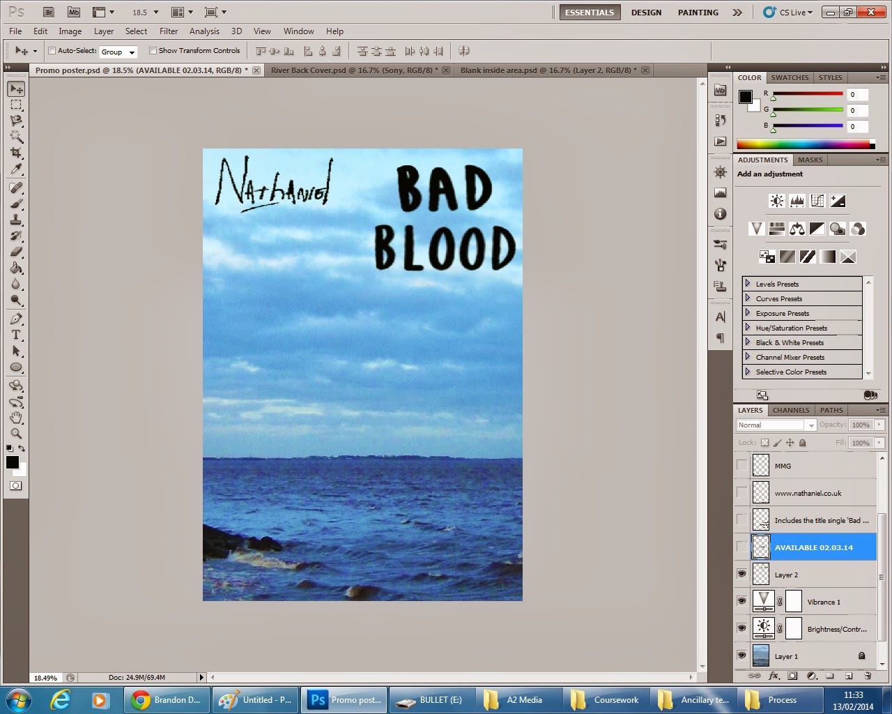
This was my promo poster before editing.


Firstly I experimented with several fonts on Photoshop, but couldn't find any that I liked as they were not bold enough for an advertisement in my opinion.

I altered the background image to be slightly more faded and less vibrant so that the advertising elements stands out more.


The second alteration I made was to the font styles as I thought they looked too plain and unprofessional.

I scanned dafont.com for some font styles that I could use that were bold enough to stand out, as well as not looking too unprofessional or immature for the purpose of advertising.


After generating my new font styles I applied them to my front cover. I altered the font style for every aspect of my front cover apart from the album and artist title.

This is my final latest (and possibly final) promotional poster.


Thursday 13 February 2014

My current promo poster alongside my chosen album cover and back cover, displaying continuity.


Experimenting with different fonts and an overlayed blended image for my promo poster.


Promo poster - Rough first draft and starting point - Production process

To begin my promo poster I chose to use the main image from
one of the two back covers I produced, to show
 continuity, like in examples I have studied such as Eminem's 'Recovery'.


I then placed this image with the desired
area within  an A4 sized Photoshop template, 
the conventional dimensions.

I then increased the brightness
 and contrast of the image.


I increased the vibrancy of the image, as the 
image appears on the back cover of my digipak.


I opened one of my two front cover
products and imported the text: 'Bad Blood'
over to the promo poster.


I then imported the artists name from the back
cover and 
re-positioned the albums title
 to take up more of the poster.


I then added a date that the media can be purchased 
and consumed, a conventional feature.
I then wrote about tracks featured on the album,
which is a conventional feature of promotional
posters.
I also included the conventional distributors and
record labels logos.
This is my first draft.

Everything produced for Digipaks (All drafts).


Possible digipak product first draft #2


Possible digipak product first draft #1


DVD (Bonus features) disc - Process of production.


I was unsure of the brightness and happiness of the image of street art on my first disc, and thought it looked slightly child like.

I discarded of the old image and began constructing a disc that would fit with the blue sky and water theme that I am creating with a complete second digipak draft.


Firstly I chose the image I wanted to use, I purposely used similar images throughout the album to show continuity like many conventional albums I have researched.


I cut the image to the correct proportions.

I then applied my previously created template over the top and placed the image in the desired location, using the lasso tool to cut around the circle template to cut out the disc shape.

In the background of this I slightly edited the appearance of the image, altering contrast, vibrancy and exposure to create this same silhouette idea that I have previously used.


I cut around the image to create a circle CD shape.


I finally made the layers containing the album and artist name visible and re-positioned the artists logo slightly.

This is my final alternate disc.

Inside center CD panel of my digipak - Production process.


Firstly I cut the original image to the correct digipak size.


Next I increased the brightness, contrast and vibrancy of the image.


I then altered the curves of the image to give it a darker feel, making my models appear more like silhouettes.


I next edited the exposure of the image slightly to enhance the visibility but to keep this silhouette effect.


This is the final product for the inside center CD panel of my digipak.

Wednesday 12 February 2014

Production of inside center left of my digipak.


I first decided the image I was going to use for the inside center left of my digipak.

I then cut this image to the proportions of the digipak, keeping the area that I would like to use in the square.


I decreased the brightness slightly, increased the contrast by a large amount and altered the 'curves' of the image until I was happy.


This is the first draft of inside center left of my digipak.

To contrast against the bright disc that will be placed on top of the image in this compartment, I decided to make this image darker than the rest in order to contrast from the CD itself. Making the main product stand out to an audience.