Monday, 23 December 2013

Ancillary text research - Metallica 'St Anger' digipak


The digipak for the band Metallica's album 'St Anger' is very abstract indeed. With the main image of  a tied up clenched fist relating to the title, with a clenched fist usually being associated with anger. This is supported by the fact the fist is red, and the use of red surrounding the fist as part of the main image, which connotes violence and danger. A large majority of the front cover is a bright orange (at least I think it is, being colourblind and all) which stands out by a vast amount in comparison to many album covers I have studied. The album cover as well as the reverse are very bright, colourful and eye-catching. This works very well, as it makes digipak stand out, as it is interesting and unique. Although this is strange due to the fact that the genre of Metallic are heavy metal, which usually has dark connotations, with a very large use of the colour black. This album cover breaks conventions.


Although the front cover does a great job of standing out, the artist, or the albums name are not featured and are left anonymous. This is not necessarily a bad feature as it will lead an audience on to look further into it and want to find out the artists name.Throughout the digipak there peculiar images of dark religious depictions, which adds a strange twisted edge to the art style.


The back cover of the digipak unfolds to form a large picture of a red skeleton, which continues this theme of danger and anger. There is a necklace placed around the skeltons neck featuring the albums logo of a fist on it, which promotes continuity throughout the product. The background underlaying the skeleton is a murky, pale grey (at least I think it is) so that the large black, red, white and yellow image of the skeleton is very dominant and draws most attention in. The text of the track listing the reverse cover is in a quirky, sharp, demonic text, which carries on these strange representations of death.

There is a barcode, institution logos and small credits on the back of the album in tiny print which gives credit to the publishers involved as well as displaying the year produced. As another required feature a barcode is also placed here, smaller than many other aspects as it is fairly unimportant, but is a requirement. A website for the band is located above the barcode which provides an audience with a link the bands other media products.

 Continuity is once again shown as the design of the main album disc is the exact same image as the front cover of the album, although in a contrasting black and white colour scheme. The DVD bonus features contained within the digipak is black, and dull, with grey writing. This disc needs no flashy design as it is an added subordinate product.

A booklet containing song lyrics is included as a conventional feature of digipaks with the exact same image as the inside of the pack, but using different framing. I could take several similar images and alternate between them for use on my front cover, back cover, disc, the inside of my digipak, and even include the same image for my front cover on my promo poster for recognition of the product, which is a common convention. The bands logo is featured in a large text in their signature style on the inside of the digipak for the first time other than the spine of the digipak which is in small print. Due to the fact that Metallica are such a large, famous band, this gives the impression that they do not need to openly advertise their name.

Sunday, 22 December 2013

Ancillary text research - Eminem 'Recovery' CD


The CD digipak for Eminem's album shows continuity brought over from the promotional poster I have recently analysed, with the exact same image on the poster as the CD front cover. The red first aid cross logo is continued from the poster, and is the substitution of the letter 'O' in the albums name. This red and white cross has quickly become a logo of this album as it was very popular worldwide, and when associated with Eminem, the logo can simply be used as a reference point for this album.

I will have to incorporate a sense of continuity like this into my own digipak product, such as how the artist is featured on the front cover, as well as the reverse, for star appeal. This conventional element is effective as this is what an audience bought the album to see, the artist. On the reverse cover, the artists presence is also asserted as he is looking directly at the camera, unlike the first image, and in the background there are signs that say 'EMINEM Welcomes you to Detroit.' This shows his dominance as a famous icon as there are signs of his name in public, I may choose to take inspiration from ideas such as this.

The blocky, bold white text is conventional for album covers, although it is against a really light blue background so it does not stand out and contrast as much as if it were against a dark, or even black background. Like many artists, the title of the album in the top right corner of the cover is in Eminem's signature font, with a backwards 'E'. This element is easily recognisable, although is artist specific.

The track listing has been chosen to be in a white font, in the area where there is a black couch that the artist is sitting on. This white font against a black background makes the text pop, and makes it easily readable and  eye catching. The font for the track numbers on the other hand is a darker, murky grey, this could show that the track names are more important, and that the exact numbers do not need to be emphasised as much.

All legal requirements, details of the producer, and a barcode are placed at the bottom of the reverse cover which are standard conventions of any digipak release. A website address for Eminem is displayed at the bottom, which is promoting the artist himself as well as the album. This will allow an audience to consume other media produced by him through Web 2.0.

The colour scheme for the album cover and reverse consists of semi bright colours, although non of the colours are extremely vivid and are quite faded and dull, especially on the reverse colour. This may reflect the artist and how he feels at the time of producing the album. Opposing this, the CD disc is in a bright, attention grabbing red, with a very large white cross in the center. This makes the CD itself a replica of the albums logo, which works very well indeed in showing continuity, as well as boldly standing out.

Saturday, 21 December 2013

Ancillary text research - Arctic Monkeys 'Whatever People Say I Am, That's What I'm Not' CD


The main image of an Indie Rock album cover usually has little relevance to the title of the album, and are usually abstract and therefore very memorable and effective. The main image in this case on the cover of the album 'Whatever People Say I Am, That's What I'm Not.' is in black and white which connotes rebellion, vintage and stereotypical Indie Rock. All of which Arctic Monkeys intend to portray with the image of their band.

There is continuity throughout the digipak which is a conventional element, this is shown through the use of a similar image on the back of the album, but with the model in a different position. The grey/black and white colour scheme also carries throughout. The fact that the model is smoking a cigarette and that the CD disc has an image consisting entirely of cigarettes printed on it also connotes non conformity, and how Arctic Monkeys like to break the rules and be rebellious. Smoking kills you, but they don't care.

The bands name is in a particular font style, with a play on words with their name as monkey tails hang from the letters. Many features such as this are used specific to a band or artist to represent them individually.  The fact that the band’s name is placed within a white box greatly contrasts with the fact that the background is very dull. This bright white aspect brings a sense of life to the album cover and most attention is drawn to the bands name because of this. 

The fact that the band did not disclose the name of the album on the front cover breaks the conventions of an album cover, although Arctic Monkeys choose to do this on several of their albums. Although it is not in large font on the front cover, the title of the album is shown on the spine of the digipak. This allows the audience to have an idea of the title of the product they are buying, without emphasising the importance of the title so much. White text for track listings is used on the reverse of the cover, which would stand out but due to the fact that the text is so small, most attention is still drawn to the main image of the smoking male. 

Conventional features such as institutional logo's, a barcode, release year info and production personnel is featured on the lower back cover, which I will need to include in my own product.

Friday, 20 December 2013

Album covers of the music videos I have textually analysed that are of the Indie Rock genre.


The single cover for Arctic Monkeys - 'Why'd you only call me when you're high?' is very simple and only consists of a plain black background, with the white outline of a phone, and the track name. This simple style is carried across from the cover for the album the track is featured on: 'AM' and has become a symbolic style that the Arctic Monkeys have adopted, showing continuity. It is simple, yet effective as it is bold, yet subtle, artistic, abstract and easily recognisable. The image of the telephone combines with the title of the song itself, so is not completely meaningless and random.


The single cover for Bastille - 'Overjoyed' follows Bastille's signature faded abstract art style on all of their EP's, which includes an artistic, yet simple main image, and a conventional font for the band which intertwines, with the inclusion of a triangle in replacement of a letter, as this is the bands logo. This art and font style contains the track as well as the bands name, and is expected of Bastille as the same art style is featured on every non-album release they produce. The bands name is featured within the center of the cover as they are the main element and the producers of the media product. The main image of the girl dressed in white overlooking the lake connotes innocence, but the fact that we cannot see her face adds an element of mystery. This exact scene is featured within the video for the media product, which shows continuity through media texts.


The single cover for the track Bastille - 'Pompeii' is consistent of the bands art style with a yet again intertwining text of the track and band name, with the inclusion of the standard triangle instead of the letter 'A', which is recognisable as the bands logo. There is a main image of an American wasteland and a sunset, which is very abstract and has no real meaning, but looks fantastic. This is due to the fact that it breaks the conventions of indie rock and is different, but simple. The location is featured within the video which yet again shows continuity through media products. The bands name is positioned in the bottom middle of the cover in larger text than the track name. This asserts the bands importance and dominance over other elements on the cover.

Thursday, 19 December 2013

Ancillary text research - Digipak conventional analysis


Here I used the example of Bastille's 'Bad Blood' album, with the title track being the song my music video is based around.

Friday, 13 December 2013

Producing mock ups of planned shots in preparation for actual filming on Final Cut Pro.


I used images similar to my shots within my music video, implementing them into FinalCutPro with the track and experimented creating mock ups of my product. I will eventually produce my product on an editing suite using Adobe Premier Pro.

Thursday, 12 December 2013

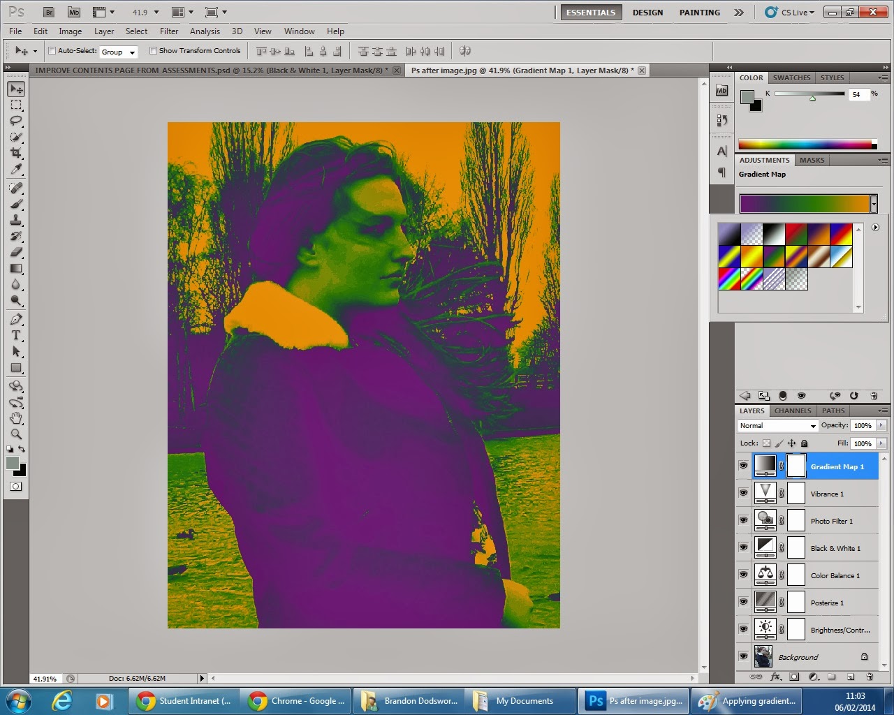
Revisiting the Photoshop skills I learned from my foundation portfolio in preparation for the production of my ancillary texts.


Before                                                                                                           After


Adjusting brightness levels.


Adjusting the contrast of the image.


Altering the colour levels of the image.


Applying a black and white effect.


Applying a gradient.


Varying the gradient applied.

Wednesday, 11 December 2013

Moral panic theory (Folk Devils) - Stanley Cohen (1972)

Moral panic theory – Stanley Cohen (1972)

The concept of moral panics was first initialised in 1972 by Stanley Cohen when he wrote about ‘Folk Devils and Moral Panics: The creation of the mods and rockers’
The term ‘moral panic’ is understood as: A condition, episode, person or groups of person that emerge to become defined as a threat to societal values and interests. These people are known as folk devils. Its nature is influenced by stereotypes within the mass media.

How do they start?

Moral panics begin when there are a projection of fears that surround a particular story or type of people. The media heavily influence and fuel these panics via films, TV, the news, radio and any other media means.
The media stereotype and assumes the worst relation to the panic and makes the consumer worry, a recent example is the London riots. The press can over emphasise and repeat footage to scare an audience.
He based his initial research on the ‘mods’ and ‘rockers’ and the conflict between these groups of teenagers in the 60’s.

Teenagers where causing mass panic due to the differences between the ‘mods’ and ‘rockers’ numerous fights were recorded and a big fight broke out of control on Brighton beach.
However the theory developed and can be applied to a number of subculture labelled as deviant or dangerous by the media.
Stanley Cohen’s findings.

He looked at how these ‘mods’ and ‘rockers’ were perceived in the public eye.
The main criticism was that these people were seen to be as a threat to law and order largely through the wat the mass media represented them this is known as ‘control culture’. 
This type of media representation is known as sensationalisation.

‘A Clockwork Orange’ fascinated a quiet grammar school boy and turned him into a brutal murderer, as he beat a tramp to death, acting out a scene directly to a scene in the film.

The press sensationalised this and blamed the film entirely for the murder to scare people.
The film changed the representation of youth in a negative way and blamed the film for many murders, referring them as ‘clockwork orange’ cases.

Summarising

Moral panics were created about the effect the film had on groups of teenagers and encouraging social deviance.

Sensationalist headlines reporting incidents of violence (deviance amplification)
The youth at the time did not seem to feel like they were being encouraged by the violence however


 They did identify with some of the representations in which the life they lived (violence etc)

Tuesday, 10 December 2013

Selective Filter Model Theory - Klapper (1960)

Klapper states that the media can only be effective/have an impact on an audience once it has undertaken 3 stages.


Audience needs to have an active (and not a passive) role in how they choose to apprehend or understand the message given and what (if any) effect it has on them.
The three stages are:
1
      Exposure – Selective exposure, the audience has the choice to engage with the media and what types of media they are exposed to.

The audience must choose to view, read or listen to the content specific media. Media messages can have no effect if no one sees or hears them. However, what the audience chooses depends upon their interests, education, work commitments and so on.
2
   Perception – Selective perception, the audience can then choose whether they wish to accept the message being conveyed.

The audience may not accept the message; some people may take notice of some media content, but decide to reject or ignore others.
For e.g. a heavy smoker may chose to ignore a Television programme which focuses on the link between smoking and lung cancer.

3 Retention – Selective retention, the audience has to then remember the message in order for it to have an effect on them.

The messages have to ‘stick’ in the mind of those who have accessed the media content. However, research indicates that most people have a tendency to remember only the things they broadly agree with.

Conclusion –

Media is only effective if we respond to the message/media we are exposed.
We cannot please all audiences. We are all individuals with different needs therefore making us have individual responses to what we are exposed to.
The media has limitations within its self as it cannot control how many people react. One text will never be consumed or liked by everyone, only a mass direct audience.          
     

Monday, 9 December 2013

The two step flow theory - Lazarsfeld et al 1940

In 1940, Lazarsfeld, Berelson and Gaudet conducted the first full-scale investigation of the effects of political mass communication.
Their research focused on the 1940 Presidential election campaign and their findings were published in 1944 in The People's Choice after more research had been conducted.


Their research was originally based on the simplistic hypodermic needle model of media influence, whereby it was assumed that a message would be transmitted from the mass media to a 'mass audience', who would absorb the message.
 
 
Lazarsfeld's investigations suggested that media effects were minimal, and that audiences did not respond to a campaign as such but were more influenced by a person they knew or an opinion leader.
The conception of a 'mass audience' was inadequate and misguided due to individuals having opinions towards a message.
Social influences had a more effect on the process of opinion formation and limited the media's effect. The research found that we are more likely to respond to people we trust and know. Lazarsfeld and his colleagues developed the notion of a 'two-step' flow of media messages, a process in which opinion leaders played a vitally important role.

Conclusions follow from their research:
 
Our responses to media messages will be mediated through our social relationships, the effects of media messages being limited by interpersonal relationships and group membership.
It is misleading to think of receivers as members of a 'mass audience' since that implies that they are all equal in their reception of media messages, whereas in fact some play a more active role than others
receiving a message does not imply responding to it; nor does non-reception imply non-response (since we may still receive the message via interpersonal communication)
there are some people amongst the media audience who act as opinion leaders they see themselves and are seen by others as having an influence on others.
Applied to my work:
The two step flow theory relates more to marketing of a product, and therefore my ancillary texts in my own case.
Although I have intended to give off certain ideas within my products (such as the message that my model is in deep thought and is nostalgic of previous events that have happened within my music video, on my promotional poster), these messages may not neccessarily be responded to by an audience in the correct way, or their response may be altered from my intentions through social interactions that the person takes part in.
For example, I may mean to convey one idea through my images, whereas a member of my target audience may have a friend which interprets my product completely differently. This friend may become an opinion leader and change the interpretations of others. Using this theory I shouldn't just assume that each and every member of my target audience will accept this one idea, as this could be changed through various aspects including social interactions. 


Uses of Gratification Theory - Blumler and Katz (1974)

Blumler and Katz (1974) argued that an audience needs have social and psychological origins which generate certain expectations about the mass media, leading to differential patterns of media exposure which result in both the gratification of needs and in other consequences. The active audience make motivated choices.
Were motivated by the desire to fulfil, or gratify certain needs.
The model is broke down into four different needs:

Surveillance – based around the idea that people feel better having the feeling that they know what is going on in the world around them. The surveillance model is all about awareness. We use the mass media to be more aware of the world, gratifying a desire for knowledge and security.

We can associate to the dominant messages of conforming via the dominant ideologies given in media texts such as music videos.

Personal identity – explains how being a subject of the media allows us to reaffirm the identity and positioning of ourselves within society. Pop stars can often become big role models, inspiring children everywhere (which is why there is such a big outcry when one of them does something wrong.)

Personal relationships – Split in two parts, relationships with the media and using the media within relationships. We can form a relationship with the media, and use the media to form a relationship with others. The television is often quite an intimate experience, by watching the same people on a regular basis we can often feel very close to them, as if we know them. When characters in a soap die, those who have watched them a lot often grieve for the character from the bond.  

The media can help make real relationships. Talking to people about what’s happening in a TV show or a popular new music video is a good example. Maybe making things that much easier when talking to strangers, giving you something to talk about.

Diversion – The diversion need describes what’s commonly termed as escapism – watching television or any other form of media so that we can forget our own lives and problems for a  while to think about something else.

We watch music videos to take our minds off our everyday lives, or want to see our favourite artists experience the same things as us. A good example of this is the music video for Katy Perry’s: ‘The One That Got Away’ about a love story which provokes an emotional response from its audience, and could be relatable to.

My media product is a story of two friends,  a male and female who have fallen out, but then make up and are happy in the end. This is a form of diversion as individuals may aspire to end up like the couple in the video, or may have experienced the same things their selves.

Wednesday, 4 December 2013

Every shot I have taken so far.

Many of these shots will not make it into the final product, and the ones that will be used may have to be re-shot for a longer time as they are too short or edited to be in slow motion to last longer, meaning editing between shots could take place to the beat of the music.


I could improve on shots that did not work so well (such as the playground rocking horse and shots of my model on the bike by using  a better angle or playing with the clips in an editing program such as FinalCut Pro.

Filming on set - the farm.

Technical equipment needed for the production of my music video.

Handheld digital video camera- I will use a handheld video camera to record and capture my footage for my music video, the camera I will be using is compact, has a high resolution for clarity, and can easily be fitted to a tripod for stability of shots.
Tripod - I will use a tripod to attach my camera to, to eliminate shaky handheld shots and improve stability.