I was unsure of the brightness and happiness of the image of street art on my first disc, and thought it looked slightly child like.
I discarded of the old image and began constructing a disc that would fit with the blue sky and water theme that I am creating with a complete second digipak draft.

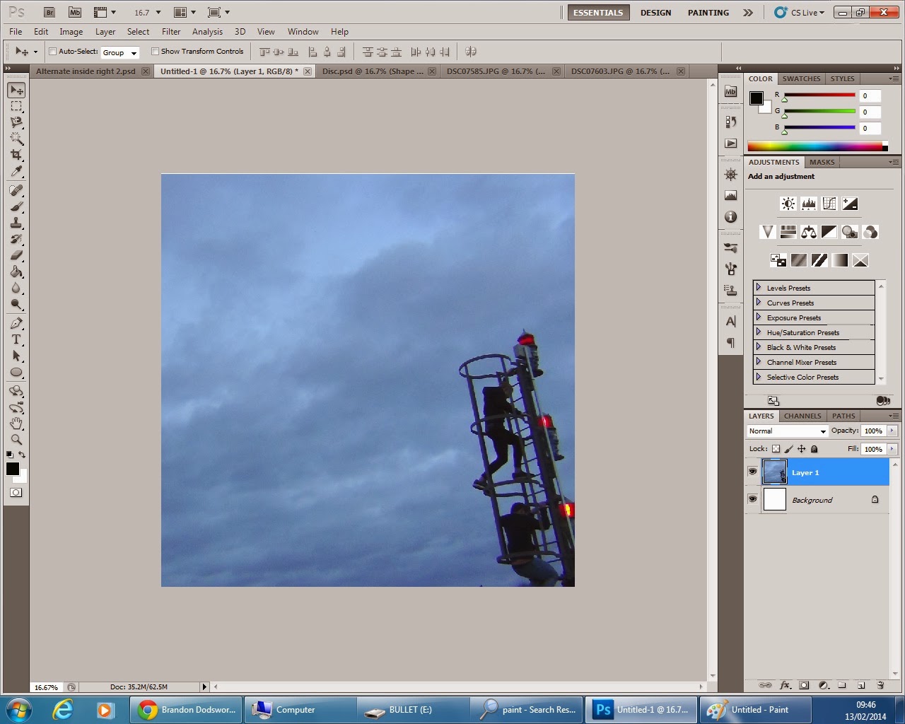
Firstly I chose the image I wanted to use, I purposely used similar images throughout the album to show continuity like many conventional albums I have researched.
I cut the image to the correct proportions.
I then applied my previously created template over the top and placed the image in the desired location, using the lasso tool to cut around the circle template to cut out the disc shape.
In the background of this I slightly edited the appearance of the image, altering contrast, vibrancy and exposure to create this same silhouette idea that I have previously used.
I cut around the image to create a circle CD shape.
I finally made the layers containing the album and artist name visible and re-positioned the artists logo slightly.
This is my final alternate disc.


No comments:
Post a Comment