Firstly I selected my image that I wanted to use.
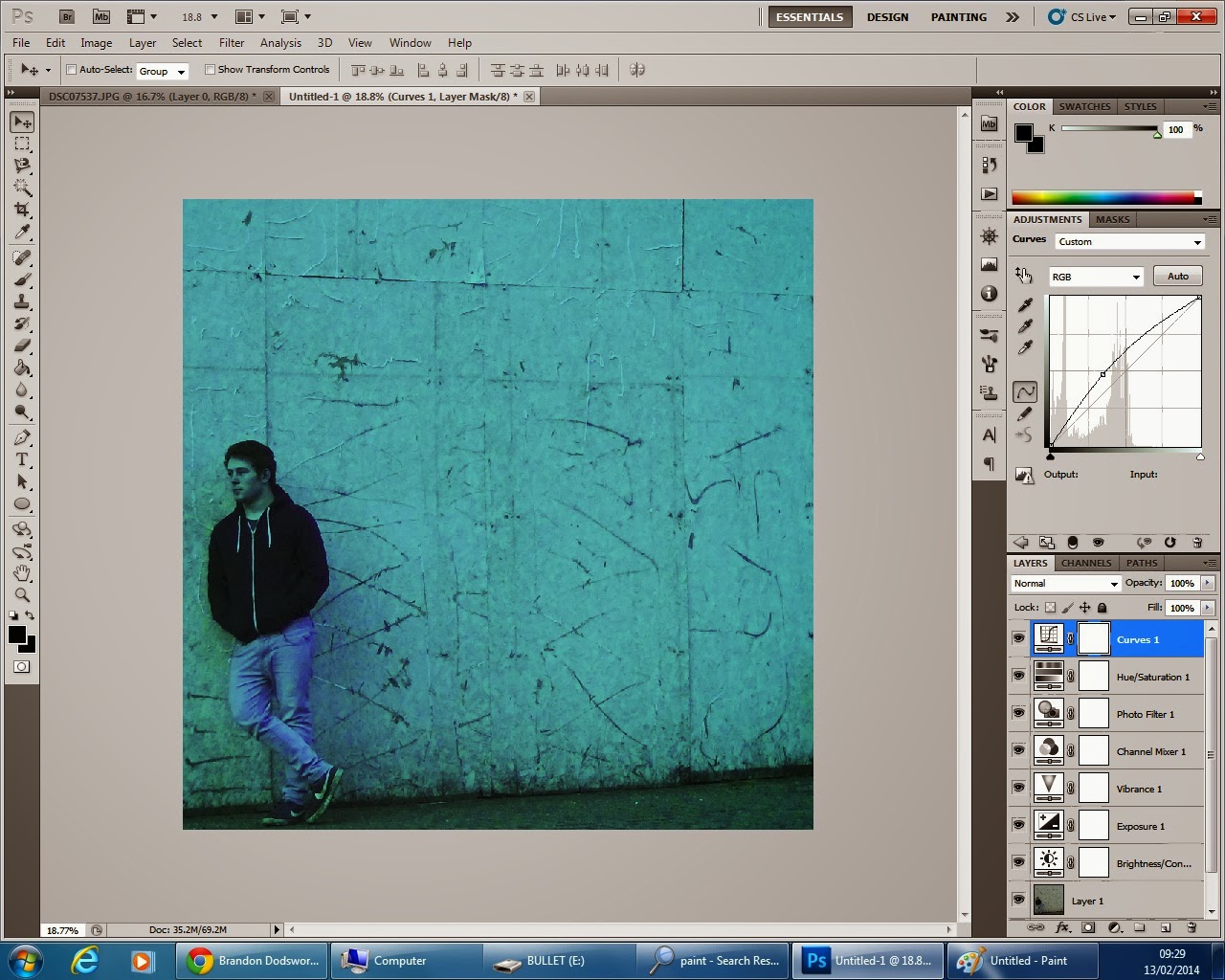
I cut this image to the desired proportions of a digipak. I also increased the brightness.
I then altered the curves of the image to make it brighter, but then dimmed this down my upping the contrast to find a level of clarity, whilst keeping a gloomy feel within the image.
I then decided that in order to achieve a murky impression, the image was a bit too bright. I altered the curves of the image once again to make it look more natural.
 I then applied a bluish hue to fit with the theme of my alternate digipak- that surrounds the colour blue, water, and the sky other than the street art version of my product.
After saving the product so far as a definite draft, I thought the image to this point looked too bland and plain.
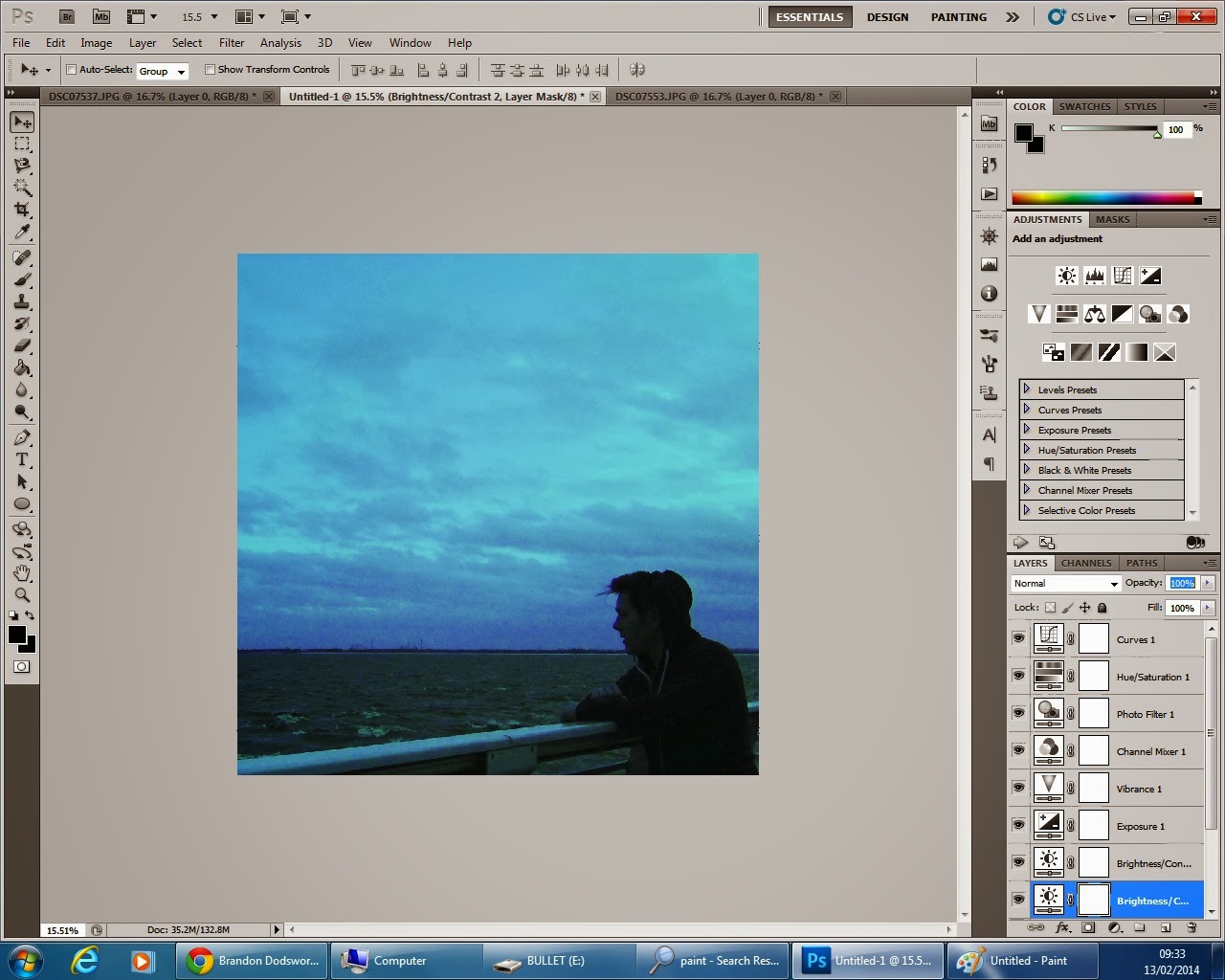
I imported a second image to overlay over the top of the previous.
I cut the image to fit over the first in the correct proportions, and increased the contrast of it.

I altered the curves of the image slightly so that it was not too dark.
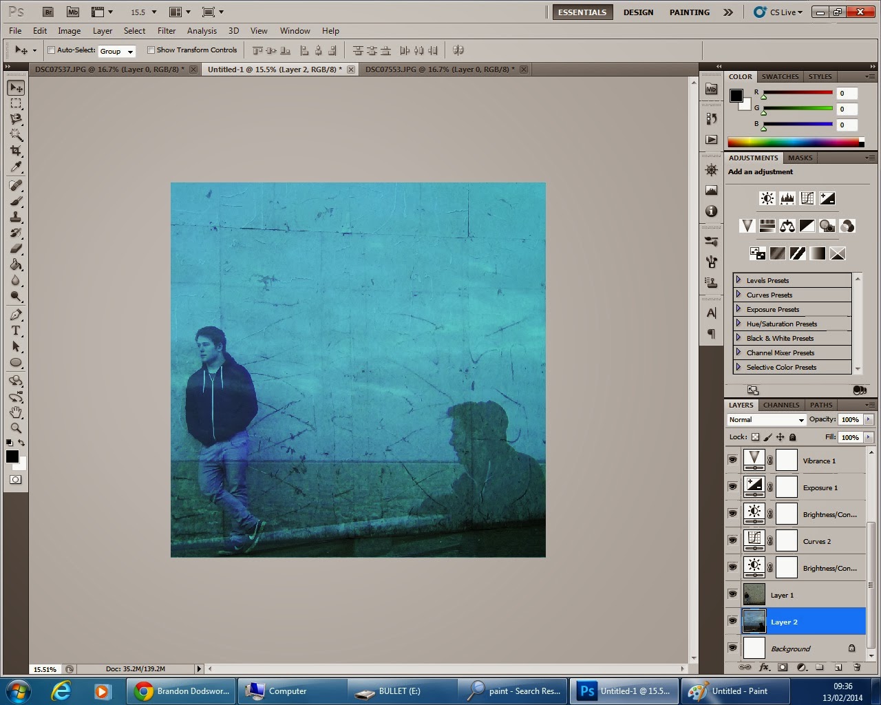
Finally I placed the first image over this second, and decreased the opacity of it to a level that was not too opaque, yet blended well.
This is my final product.

I altered the curves of the image slightly so that it was not too dark.
Finally I placed the first image over this second, and decreased the opacity of it to a level that was not too opaque, yet blended well.
This is my final product.


No comments:
Post a Comment