 |
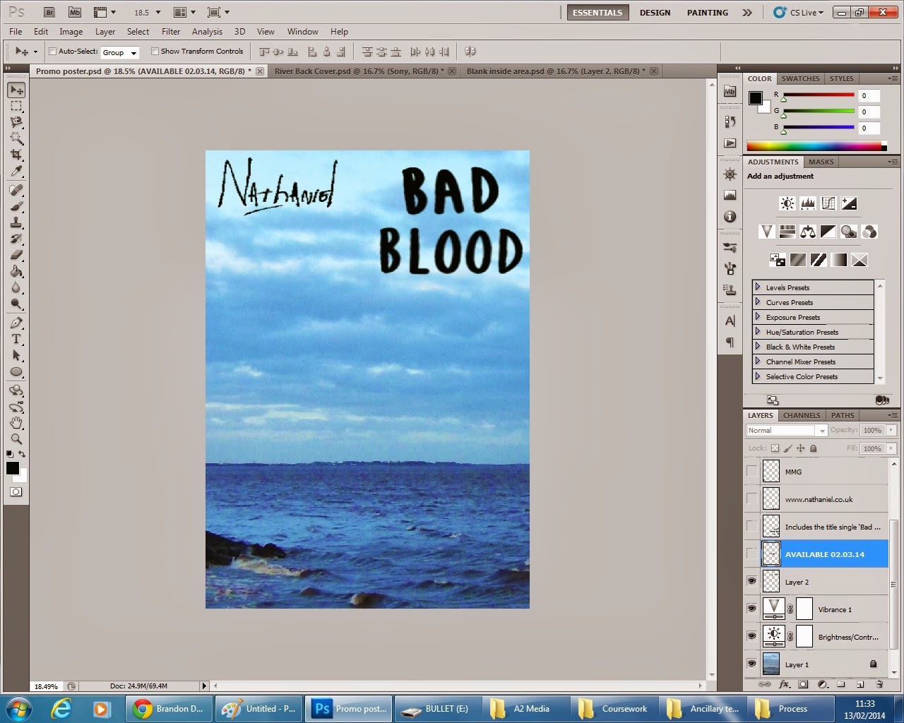
| To begin my promo poster I chose to use the main image from one of the two back covers I produced, to show continuity, like in examples I have studied such as Eminem's 'Recovery'. |
 |
I then placed this image with the desired
area within an A4 sized Photoshop template,
the conventional dimensions.
|
 |
| I then increased the brightness and contrast of the image. |
 |
I increased the vibrancy of the image, as the
image appears on the back cover of my digipak.
|
 |
| I opened one of my two front cover products and imported the text: 'Bad Blood' over to the promo poster. |

 |
| I then imported the artists name from the back cover and re-positioned the albums title to take up more of the poster. |


No comments:
Post a Comment